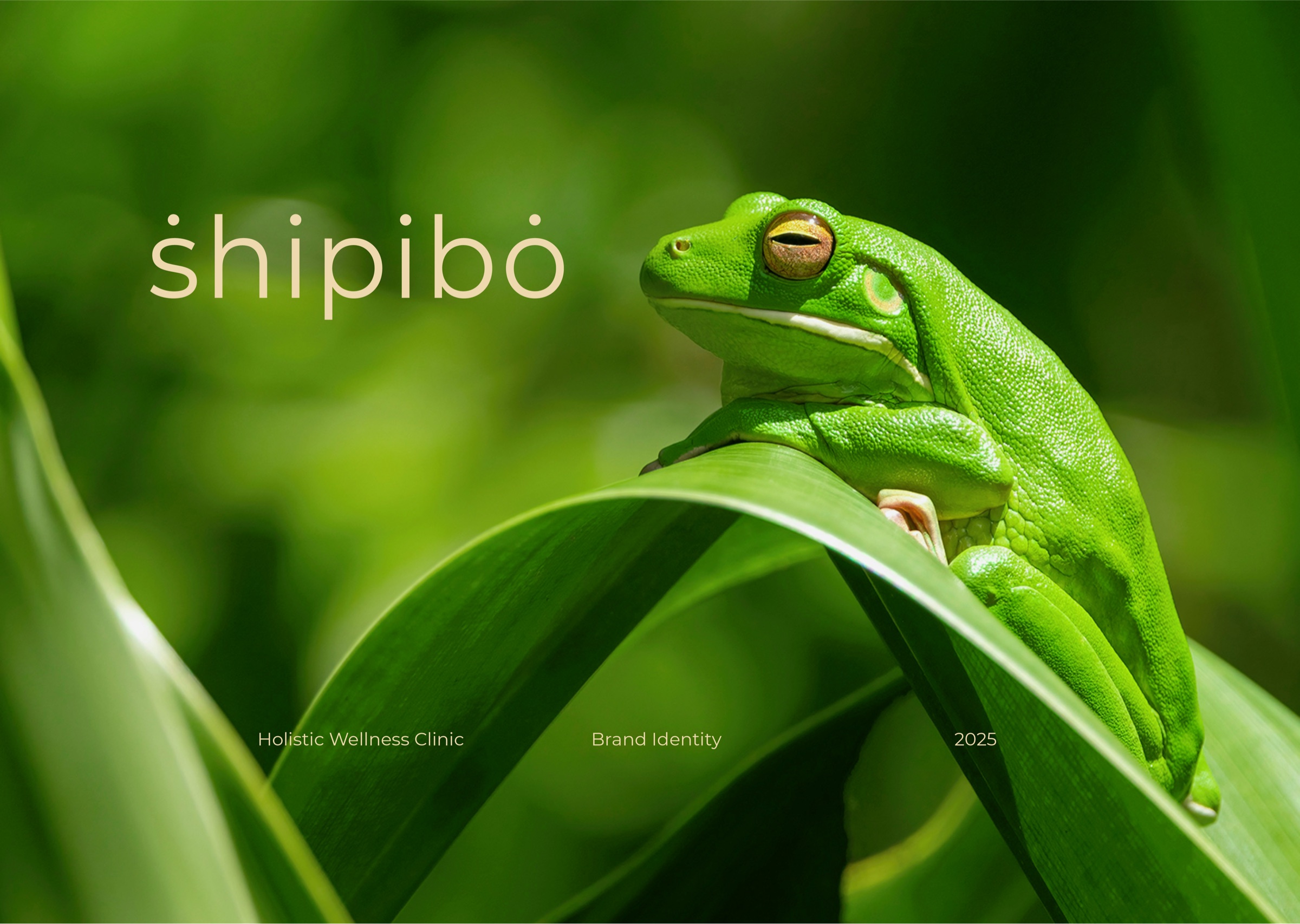
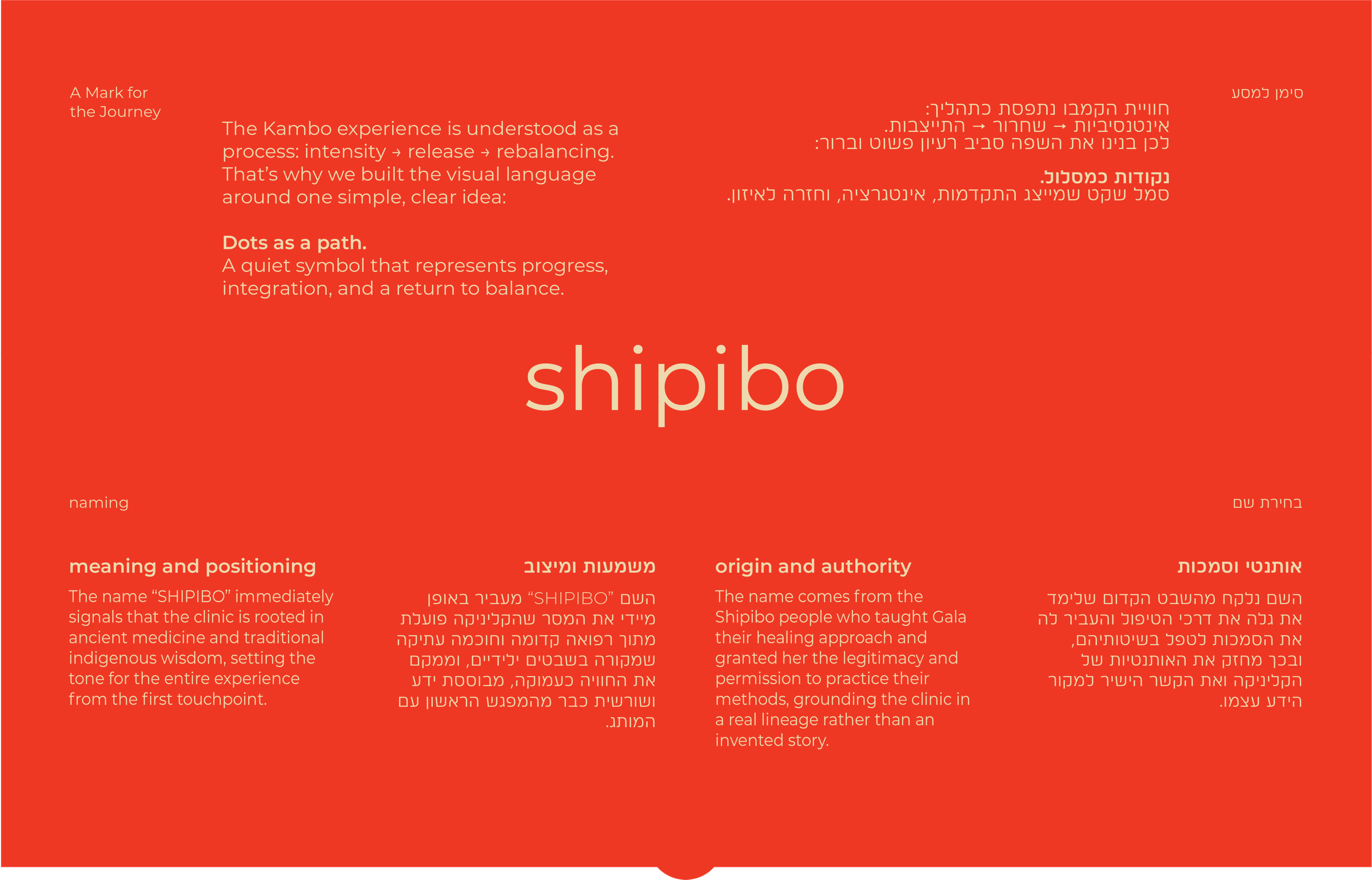
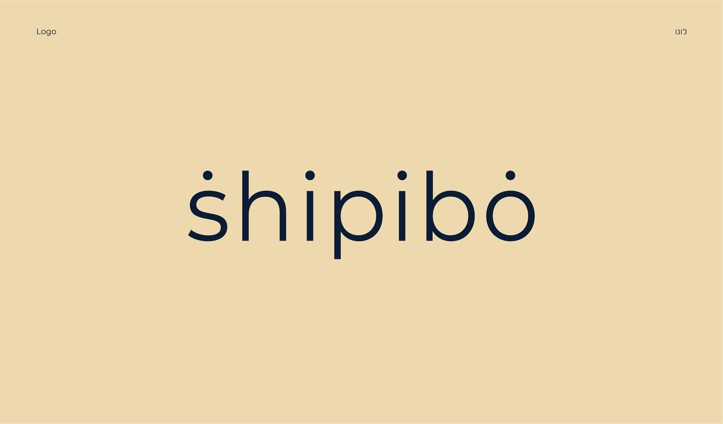
Shipibo — Ritual Wellness Brand World
A ritual wellness brand built between
ancestral strength and clinical trust.
- Client
- Shipibo
- Year
- 2025
- Services
- Brand Strategy / Visual Identity / Ritual System / Campaign Direction
- Scope
- Brand world / Wellness / Ritual care / Campaign
01 / Brief
The brief
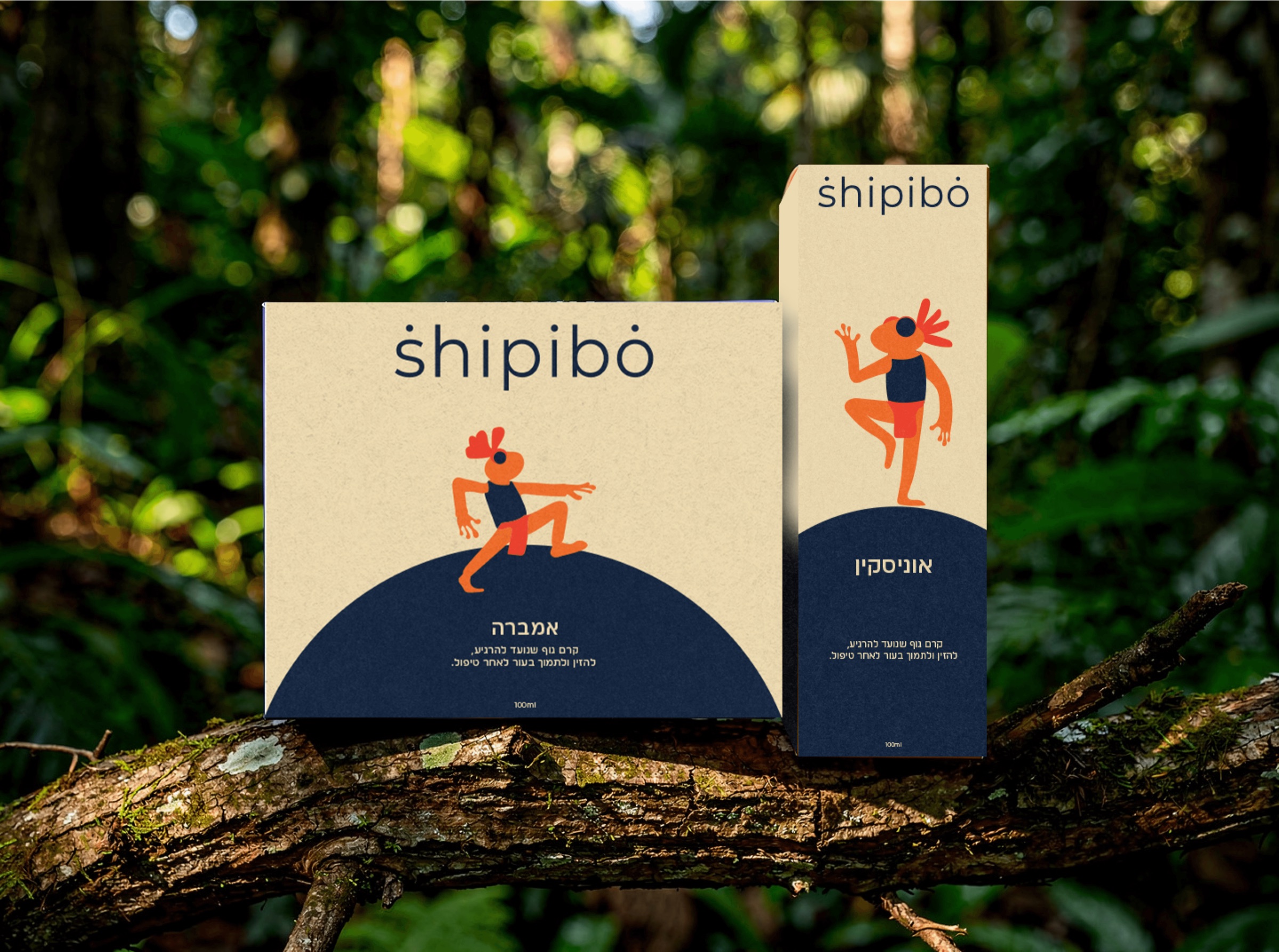
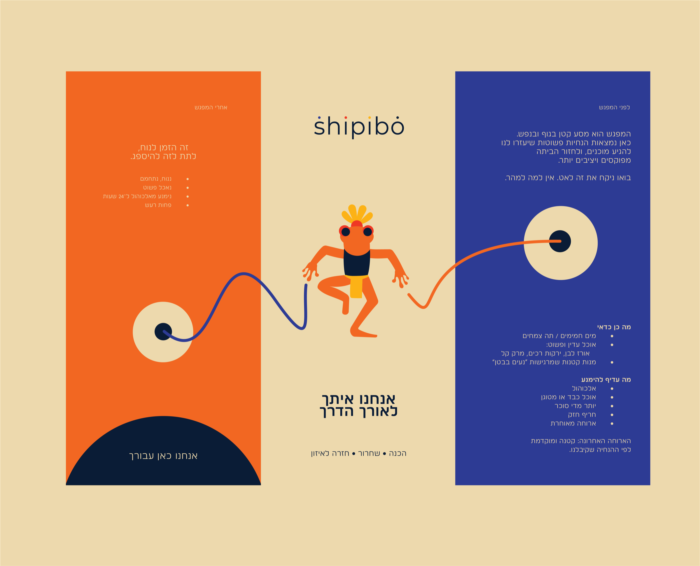
Shipibo needed a brand system that could hold two forces at once — the primal, symbolic power of ritual practice and the calm credibility of a modern wellness experience.
The challenge was to create a visual world that felt rooted, powerful, and respectful while giving visitors a sense of safety, clarity, and trust. The brand had to prepare people emotionally, then visually.
02 / Approach
The approach
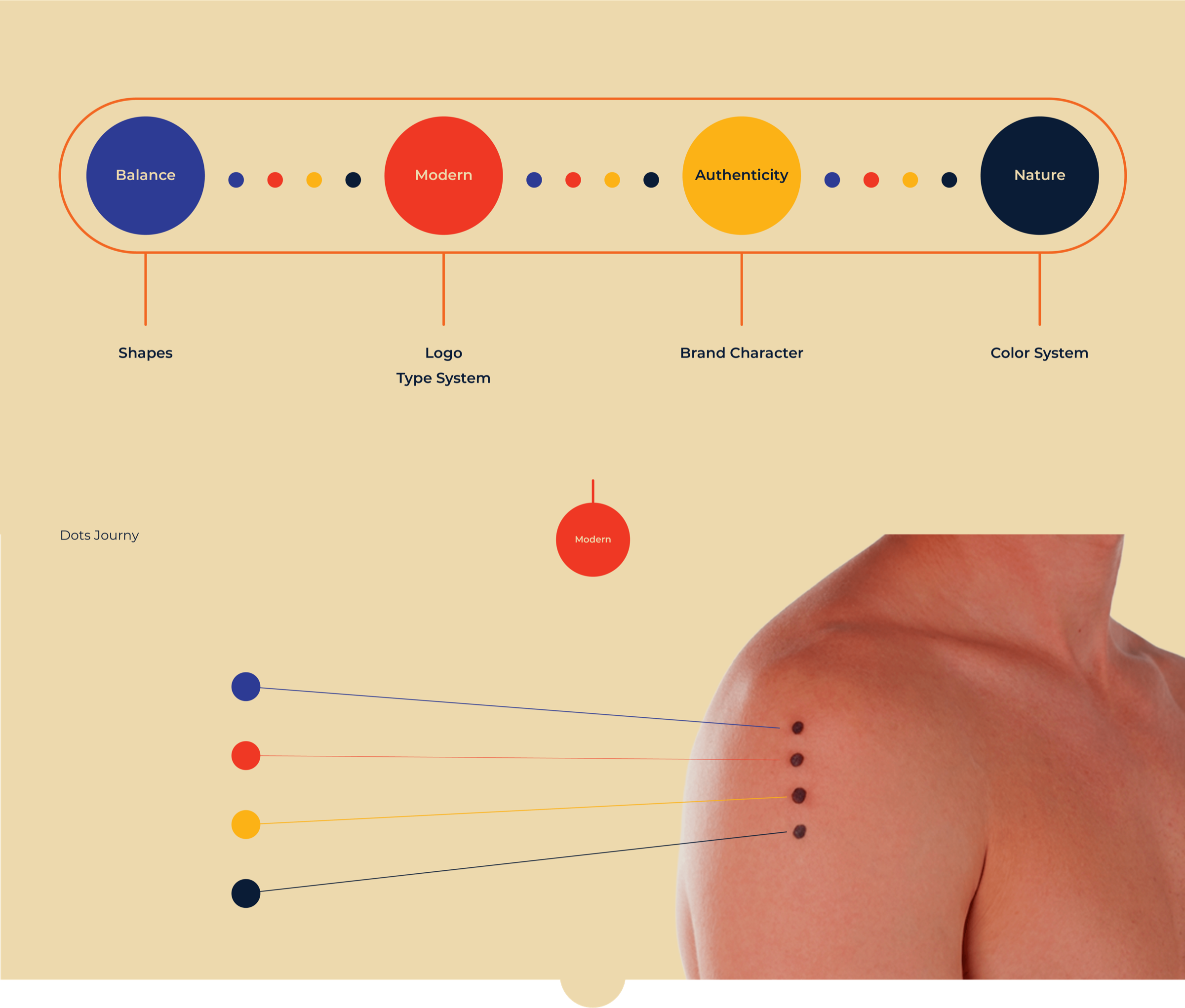
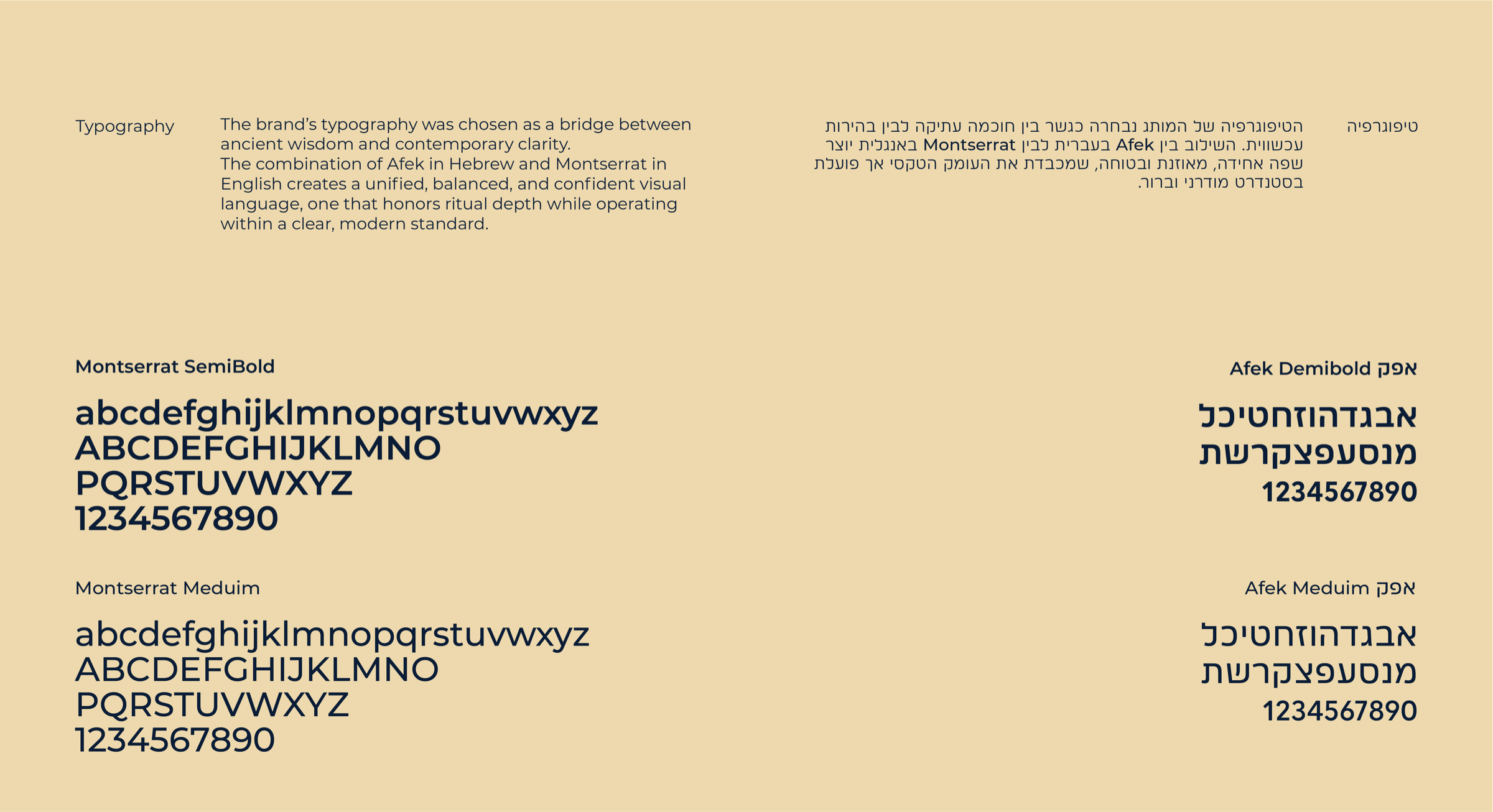
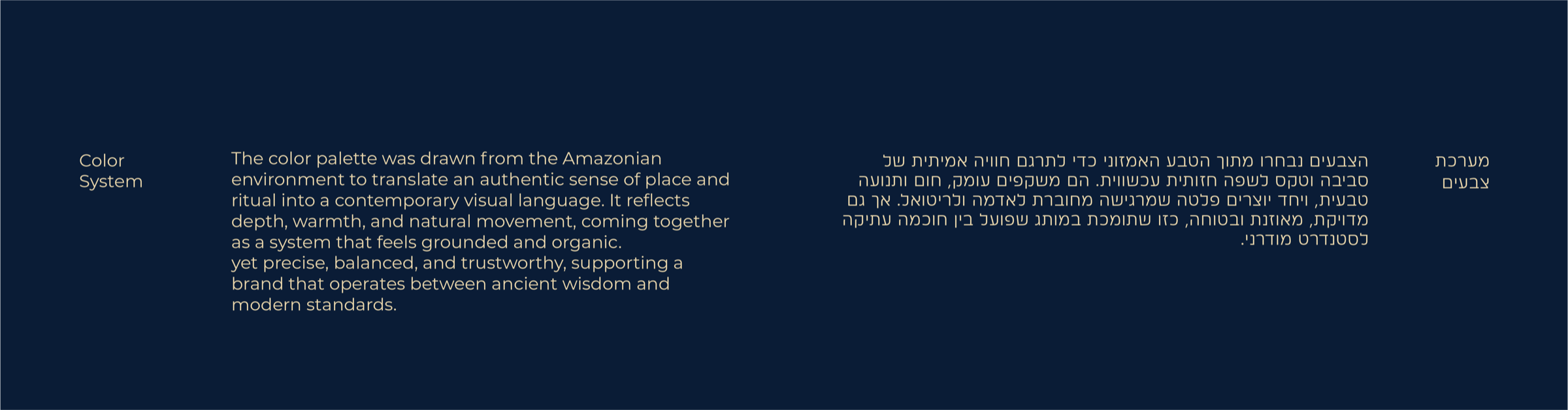


03 / What we built
What we built
04 / Outcome
Outcome
A visual system that gives Shipibo a recognizable world — calm enough to build trust, strong enough to carry ritual intensity, and flexible enough to move across brand, campaign, product, and digital experience.
more